Color Study
 Color makes me feel a bit drunk. I quickly feel overwhelmed by choices.
Am I a purple person? I look best in reds, but when I try to get myself to weave with warm colors, it feels like too much. I wear a lot of black and grey, but knitting with neutrals, especially in the winter, when we are surrounded by an absence of color, seems unrewarding. If there's no color in the landscape, wouldn't I want to import it into my craft work?
And I love the look of Scandinavian textiles - soft yellows, gentle and clear blues, whites and creams and black. But having painted two rooms in my house yellow and now considering a third room, wouldn't it make sense to try to bridge out from this family? In decorating, I tend to gravitate toward soft blues and pinks and greens. Here's my dining room wallpaper, which I noticed is the same color family as the duvet cover on the bed of my yellow bedroom...
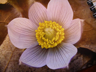
 I decided to try to focus by tearing out photos from magazines and my last year's Audubon calendar. The goal is to let my eye lead me, instead of my analytical brain. (However, as I tell my yoga students, even if our customary patterns sometimes make us a bit nuts, the fact of the matter is that we spend years honing these patterns, and you don't want to just throw all that effort out the window. Analytical brain, still good, just maybe not for choosing color.)
 I decided to try to focus by tearing out photos from magazines and my last year's Audubon calendar. The goal is to let my eye lead me, instead of my analytical brain. (However, as I tell my yoga students, even if our customary patterns sometimes make us a bit nuts, the fact of the matter is that we spend years honing these patterns, and you don't want to just throw all that effort out the window. Analytical brain, still good, just maybe not for choosing color.)

Comments